I thought I'd experiment a bit with some custom posters and a personal idea for a shady 1970s research company and I had come up with this poster of the everyday employee of this company, along with this I had made the logo as well as a color palette for those inclined to use.
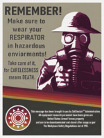
Really like the logo and color scheme fitting to the 70s feel and "CARELESSNESS means DEATH" makes the SolSinclair Administration seem dark or morbid at least for me.
It was 90% made out of rotated boxes in Photoshop, then I added in a photo from another poster in, changed the colour as to fit the top bar. Then I added the logo, the white text then duplicated it, made it black and placed it a few CM from the white text. I merged all layers, upscaled it then I added a paper texture on top to give it that classic poster feel
This site uses cookies to help personalise content, tailor your experience and to keep you logged in if you register.
By continuing to use this site, you are consenting to our use of cookies.