vilhjalmrf
MCP Agent / Combine Killer
- Joined
- Sep 8, 2021
- Messages
- 648
- Thread Author
- #1
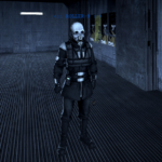
The blue text that displays a unit's tagline is a little bland and too big. And the fact that you can see a unit's tagline through a wall is a little silly in my opinion. Also makes it harder to get away with things when you don't want a fellow officer to walk in on you and tattle tale. I suggest the following:
- Have the text be smaller, only just enough for units to read it.
- A status below it can go with it nicely like if the unit is cohesive (suit active) or non-cohesive (suit deactivated). Not really needed but a nice touch.
- The tagline only visible within close range and given a certain field of view.
- Cannot see tagline through walls.