
Welcome!

By registering with us, you'll be able to discuss, share and private message with other members of our community.

SignUp Now!

Does anyone else find the forum layout really confusing?

WhamSham

New member
Joined
May 30, 2021
Messages
11
Personally it just seems really noisy and some of the forums have weird organisation

The most used forums are at the bottom of the homepage for instance

And the homepage itself seems pretty messy with loads of different windows with different scaling

I also found it pretty confusing to navigate when I got started, finding out how to apply for stuff was particularly confusing

Maybe it's just me though just wanted to check lol

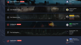
edit: just an example of the weird formatting
Screenshot 2021-06-21 at 01.32.04.png

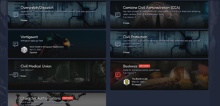
All of these categories only have the guide for these factions not the applications themselves, in order to find those you have to scroll down to the bottom:
Screenshot 2021-06-21 at 01.35.31.png

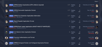
This is where you actually post the applications if you want to find the actual format you need to scroll down again
Screenshot 2021-06-21 at 01.35.39.png

Why aren't these organised under actual faction categories???
 
Last edited:
Hiya mate.

So it first started with me, Atle and everyone baring the same communal role as myself had taken part in a small discussion about that forum restructure to experiment around in placing all of the Half Life related applications, information, recreation and anything gameplay related to the top as the first perceived threads to view instead of the last. This is to reinforce visitors entering the forums to interact and garner what intel they need about how we're expecting to function and what exactly we are placing ourselves out to be.

Admittingly, it is a totally "alien" commencement considering every community's kept with the general interactions at the highest order of forum activity since... forever.

We thought we'd try and give it a go, see if it hits a soft spot or not. So far I think you're the first speaking about this publicly and to give you any benefit of doubt, should it not be of any benefit to keeping our primary server linked activities to the top, it can be reverted.

---

Quality of Life improvements are being worked on as I speak, and also all of the formats are in the same place because they're easily identifiable. For the last picture though, you open up the format and then you easily click into where you want to place it. Doesn't seem weird to me - it's easy to navigate and it appears to be working thus far. Applications and guides have always and will always be separate and placing them in their respective categories above them will make them disappear since only you can see your own application (for various factions, that is.)
 
I think it's definitely a case of some smaller Quality Of Life changes, rather than a whole restructuring - apart from the applications as you said, I can fairly easily find whatever I'm looking for. Main Announcements at the top (important/heavy use), HL2RP stuff right below (heavily used), and more community and support elements are below that (that'll only be used if you have a specific problem, or you're wanting to chat on the forums - relatively less use). Works for me!
 
Definitely differs from the norm, I find it much better in terms of layout, though that largely goes down to personal preferences. Not confusing at all.
 
To me it seems really nice and sleek. Never had any issues with it, but I've been used to this forum 'layout' for a long time now, so that may be why I can't really see the issue.
 
Back
Top