Welcome!

By registering with us, you'll be able to discuss, share and private message with other members of our community.

SignUp Now!

Give Overwatch Factions (OTA/CPs) a more immersive hud.

Noh

I LOVE CITRUS!
Joined
Sep 4, 2021
Messages
173
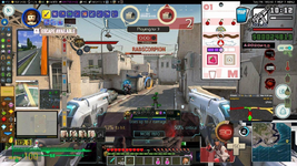
Now, I'm not saying bring back the ESP we all had, but currently, the hud on Willard Networks is very un-immersive. It feels more like a Video Game UI with the binoculars overlaying a top of it. Server from 2012 had better huds for OTA/CPs than Willard Networks at the moment, and I'm sure adding flavor text and more Combine hud elements isn't that difficult of a feat.

Hell, even a Semi-Serious RP has a better-looking hud (if you don't look at the Impulse shit on the bottom left corner) than us. LINK

Overall, I can say that the UI and HUD are just overly un-immersive, even as a Citizen faction. There's gotta' be a way to make it not look horrible.
 
If anyone uses AuraWatch as a reference for what the new HUD could look like I'm going to cry.
I don't mind the minimalistic HUD honestly, it's much better than having an extremely cramped HUD that takes up every inch of your screen like AuraWatch does. I'd also prefer if I didn't have a permanently super-blue overlay on my screen to make the HUD feel busier. Though some additional stuff wouldn't be that bad I guess.
 
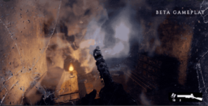
In my opinion,if they do make a new cp hud, it should look something like the gasmask overlay from Metro Exodus, but little more subtler.

Example:

1647187769550.pngJust imagine this, but more combine styled and with a more advanced look,
and without cracks
 
Last edited:
i'm in if devs only add the blue visor effect of the combine's eyes.

adding more stuff is kinda pointless

(also maybe add some animation to when stability changes or something which is still pointless but i wouldnt mind)
 
the nebulous hud or similar would be more than enough. personally i think the aurawatch hud isn't too cumbersome but for general day-to-day RP it might be too much.

what we have now is literally nothing. CPs have some sort of visual HUD elements ICly even in HL2 ("prepare for visual download"). out hud? non-existent.

and prior to it disappearing, it was really generic and looked unfinished and unpolished.
 
Insulting the (1) dev we have with a provocative title isn't going to make him work harder or faster.
 
what we have now is literally nothing. CPs have some sort of visual HUD elements ICly even in HL2 ("prepare for visual download"). out hud? non-existent.

probably another throwaway voice line. it's another one of those things up for speculation but it could very easily be in reference to the terminals or something akin to a datapad, rather than a mini-computer mass produced into soviet surplus gas masks

barebones/minimalist hud is a nice design choice for cps, imo. maybe ota is a different story
 
How do U all disagree with a change that affects nothing but aesthetics?
 
Cause it's an insignificant one, our single dev has bigger fish to fry at the moment.
Not like im saying "DO IT NOW! NOW!" Just putting it up so ppl know.
 
I have suggested an advanced HUD/UI system for Combine factions, specifically one that our predecessor, TeslaCloud, was planning to use, but @Atle gave strong objections to it, so we dropped the idea rather quickly. That's the main reason we don't have any sort of 'immersive' UI elements.
 
I have suggested an advanced HUD/UI system for Combine factions, specifically one that our predecessor, TeslaCloud, was planning to use, but @Atle gave strong objections to it, so we dropped the idea rather quickly. That's the main reason we don't have any sort of 'immersive' UI elements.

i think we should at least see what it would have looked like and perhaps take a vote

no offense to atle but it's not like he actually plays combine
 
i think we should at least see what it would have looked like and perhaps take a vote

no offense to atle but it's not like he actually plays combine
1635557217822.png


Concept by Flanders, following the original Nebulous/Person of Interest designs. Of course, the citizen identification would likely not be a thing, or perhaps only be restricted to dispatchers, but this was the basic idea.

unknown.png


This part was the main suggestion since everything else was a bit cluttered, but it was denied, so /shrug.
 
1635557217822.png


Concept by Flanders, following the original Nebulous/Person of Interest designs. Of course, the citizen identification would likely not be a thing, or perhaps only be restricted to dispatchers, but this was the basic idea.

unknown.png


This part was the main suggestion since everything else was a bit cluttered, but it was denied, so /shrug.
This is great, cutting it down a little would make it amazing, such as the profile pictures or other clutter
 
Back
Top